Building a brand around the idea that beauty belongs in everyday life.
BRAND BUILDING | CREATIVE DIRECTION | ART DIRECTION | GRAPHIC DESING | FASHION CURATION | VISUAL MERCHANDISING
Polita was created as a curated family concept store, bringing together fashion and lifestyle products chosen for their design, functionality and sustainability.
I built the brand from the ground up, developing its strategy, identity and visual language around a simple idea: beauty should surround us in everyday life.
The challenge was to create a distinctive brand that could bring together different products and brands under one recognisable point of view, while always letting the product be the standard.
From the business creation & brand strategy to identity, packaging, retail, ecommerce and content, I built a complete visual world designed to make every detail feel Polita.
01 — THE CHALLENGE
A universe to connect with new, modern families
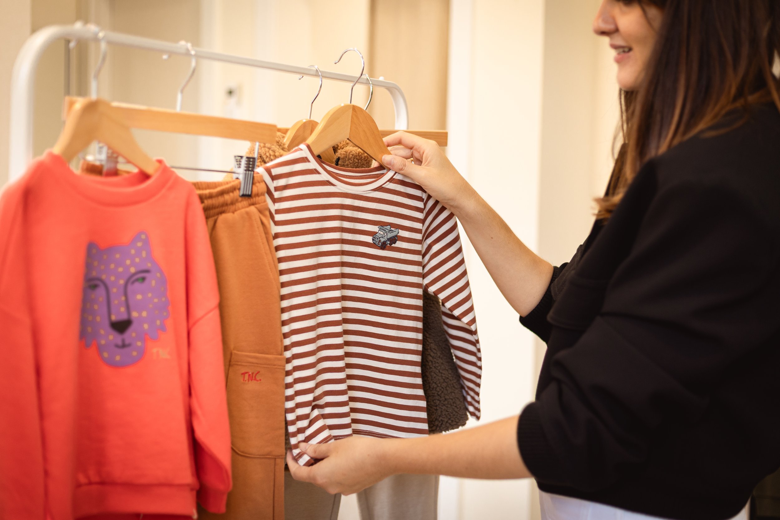
Polita was created as a family concept store built around a curated selection of fashion and lifestyle products — combining design, functionality, sustainability and a personalised experience.
The challenge was to create a brand that was recognisable and ownable, while bringing together different brands under one coherent point of view.
At the heart of Polita was a simple belief: families can build a life filled with beauty and wellbeing through more conscious choices, shopping local.
The identity therefore needed to do more than look beautiful. It had to curate, elevate and connect the products, creating a recognisable world around them.
The product was the standard.
02 — THE APPROACH
Construye una vida Polita
Rather than treating the brand identity as a collection of visual assets, I approached Polita as a complete brand experience.
The idea of “Construye una vida Polita” “Eraiki zuen bizitza Polita” in basque became the foundation: a brand that inspires new families to surround themselves with things that combine beauty, functionality and purpose. From there, I built a visual system designed to feel warm, distinctive and contemporary, while remaining flexible enough to work across very different products, brands and touchpoints.
The identity extended from naming, logo, colour and typography to imagery, packaging, retail, ecommerce and social, creating one recognisable world around the curated selection.
A brand designed to make the whole selection feel Polita.
03 — THE BRAND IDEA
Polita — a name, a standard, a point of view
The name Polita, meaning beautiful in Basque, connected the brand to its local roots while remaining approachable for families across Euskadi.
But Polita was about more than beautiful products. It was about the beauty of being yourself — accompanying families through different stages, from early motherhood to the development of each child’s own identity. The idea was that every child could be Polita in their own way, reflecting the brand’s belief in individuality, creativity and real families.
At the same time, Polita became the standard. Every brand, garment, accessory or object had to meet the same level of quality, design and values to earn its place in the selection.
The visual identity translated this into a distinctive serif wordmark, with two expressions: a more formal horizontal version and a playful vertical construction inspired by building blocks, connection and support.
Not one way to be Polita. Your way.
The Lookiero experience had always been at the heart of the brand.
The challenge was to make that experience more visible, tangible and emotionally relevant through communication — from the first interaction with the service to the moment a customer discovers herself in a new look.
The unboxing moment had always been one of the most recognisable parts of the Lookiero experience: the first physical interaction with a personalised selection. With the new visual direction, we curated how this moment was portrayed, paying greater attention to composition, styling, colour, texture and the relationship between the box, the garments and the person receiving them.
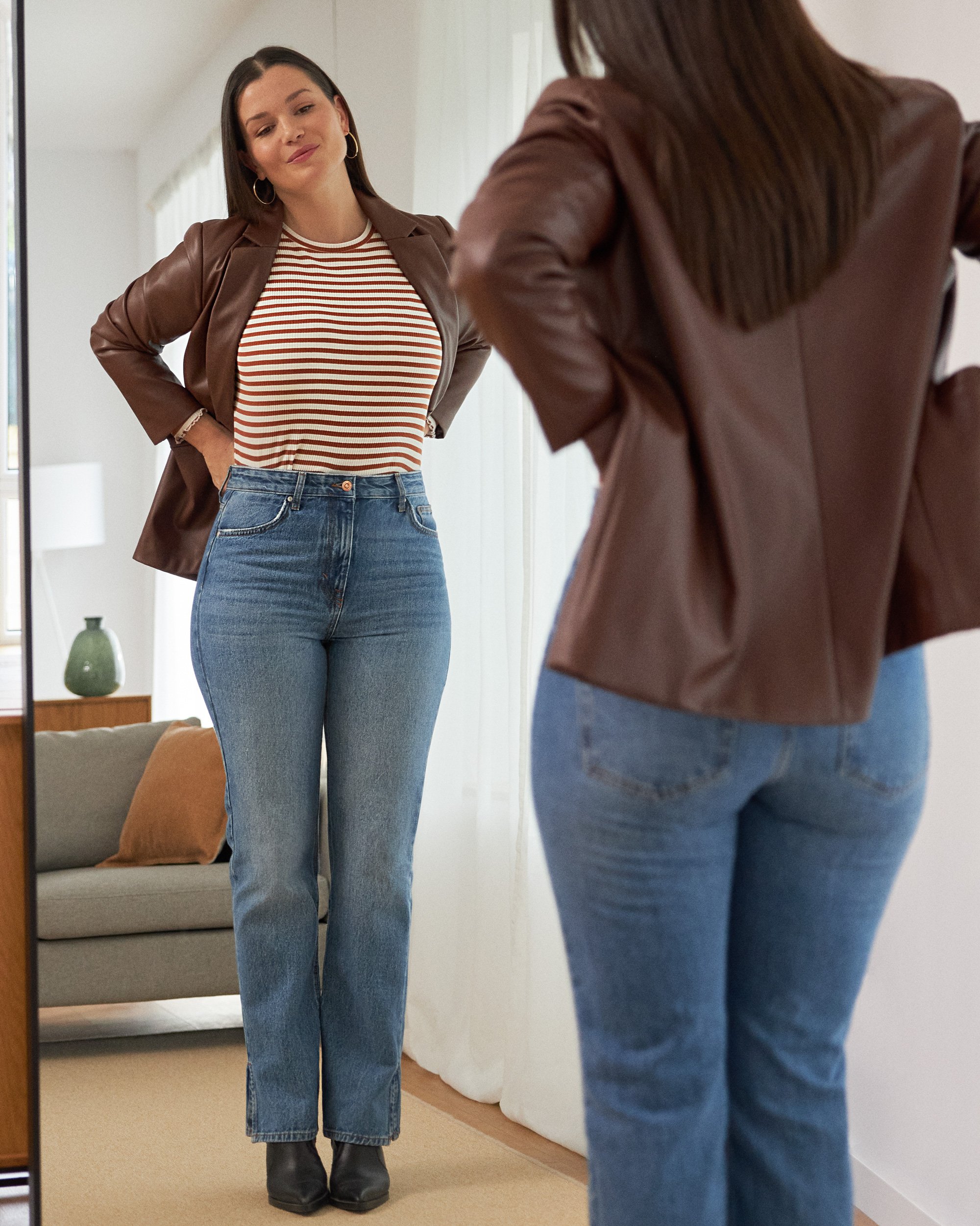
But the experience didn't end when the box was opened. We wanted to bring the moment of trying on and looking in the mirror to the forefront — that intimate moment when the customer sees herself in the clothes for the first time.
Through observing the experience, we identified this as a particularly powerful “before and after” moment: the small bloom of surprise, recognition or confidence that happens when something simply feels right.
This became an important visual territory for the brand. Instead of only showing the clothes, we wanted to show what the clothes make possible — the personal experience of discovering a look that feels like you.
The idea was carried through launch communication, organic content and paid media, where the experience also had an important functional role: helping new customers understand how Lookiero works, from sign-up and the style profile to the Personal Shopper selection, unboxing, trying on and discovering their looks.
From opening the box to seeing yourself differently — the Lookiero experience became part of the story.
The Lookiero Moment
Making the experience the story
The Personal Shopper
A style curator behind every box
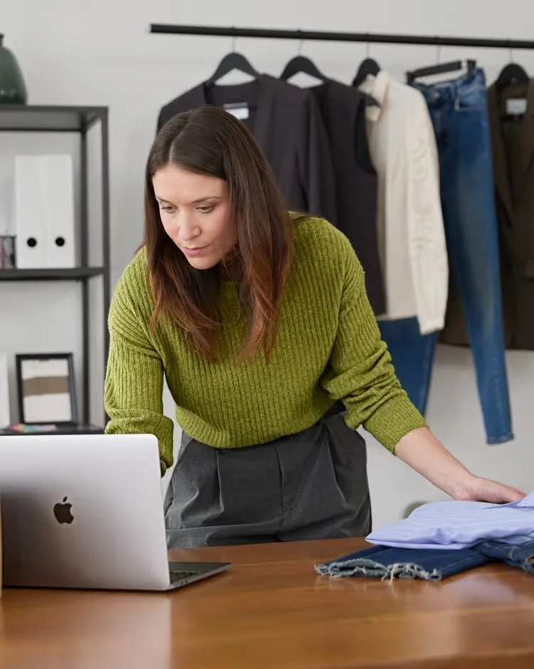
The Personal Shopper is the human connection between Lookiero and its customers, combining closeness with fashion expertise.
The repositioning evolved her role into that of a Style Curator: using her knowledge to make fashion easier and help each customer discover what works for her.
Visually, we showed the expertise behind every box — working with garments, creating looks, exploring trends and building moodboards — while keeping her representation natural, personal and approachable.
Close enough to understand you. Expert enough to curate for you.
03 — LAUNCHING THE BRAND
Introducing a new face for Lookiero
The new brand was launched through a manifesto film designed to introduce Lookiero’s new positioning and give its refreshed identity a human, emotional voice.
The film brought the new brand narratives to life, putting personalisation, self-expression and the idea of “Fashion that fits you” at the centre. Rather than explaining the rebrand, it was designed to make the new Lookiero feel — warmer, more human, optimistic and personal.
Visually, the film brought together the new art direction, colour palette, typography and graphic language, establishing the visual codes that would shape the brand across its next chapter.
A new face for Lookiero. A new way to see online personal shopping.
Paid Media;
The first point of contact
Paid media was often the first interaction customers had with the Lookiero brand. The challenge was to introduce the new positioning without losing the formats and approaches we already knew performed well.
We restyled existing paid formats through the new visual and verbal direction — refreshing imagery, colour, typography and tone while keeping the structures that were already working.
The result was a more recognisable and contemporary first impression, bringing the new Lookiero to customers from their very first interaction.
New brand. Familiar formats. A new first impression.